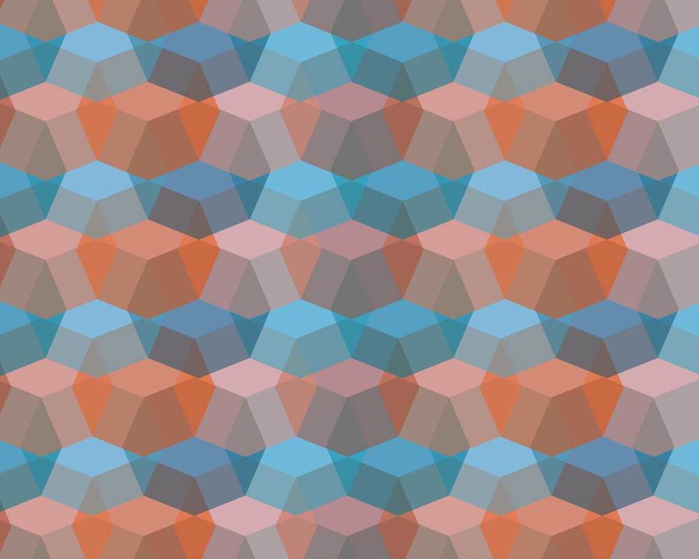
Overview: The purpose of this exhibit is to demonstrate my ability to use shapes in Photoshop to create backgrounds that can be used in design.
Design Principles Contrast: Orange and blue were selected, contrasting colors. Repetition: Only one shape was used in this whole design, an 8 sided polygon. It was repeated multiple times. Alignment: Effort was made to lay out the shape patterns so they reflected an organized pattern. Proximity: The copies of the shapes were placed closely to one another to not only create a repeating pattern, but to have the placement of the shapes create a new shape that repeats.
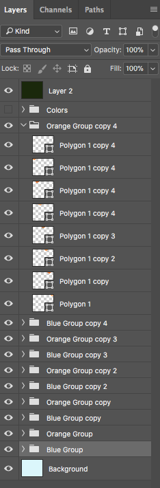
Photoshop Skills: To create this geometric background I first created a polygonal shape. I then copied the shape multiple times and adjusted the colors to create a pattern. I copied this one line of geometric shapes multiple times changing the colors and overlaying them on top of each other to fill the design space. This design took a lot of copying and pasting, and special care to organize layers so they can be easily accessed.
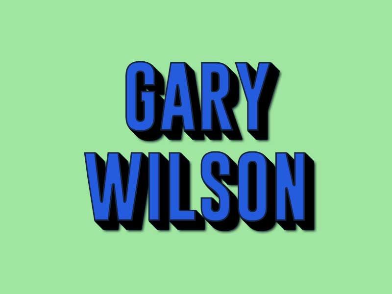
Overview: The purpose of this exhibit is to demonstrate how to create a new style in Photoshop.
Design Principles Contrast: Blue and a pale green were used to contrast one another. A dark deep blue was used for a stroke to set the two colors apart. Repetition: The same style was applied to both lines of text in this design. Alignment: The text was centered, creating a balanced feel for the overall design. Proximity: I applied a drop shadow multiple times to the same element of text. I needed to make sure the proximity of the drop shadow was close enough so it didn't look chunky.
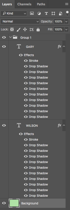
Photoshop Skills: To create this design, I downloaded a new font, GoBold. A word of warning. Something I downloaded brought some kind of malware to my computer and it has made it incredibly hard to get to any websites. I have to take my computer in to a repair shop. So, word of warning, be careful about from where you are downloading resources! To create this new style I named, Deep Drop Shadow, I selected the layer with text and adding some blending options, specifically the drop shadow. I changed the blend mode to multiply, adjusted the angle to 135, and the slowly built up the distance pixels to give it a deep drop shadow look.