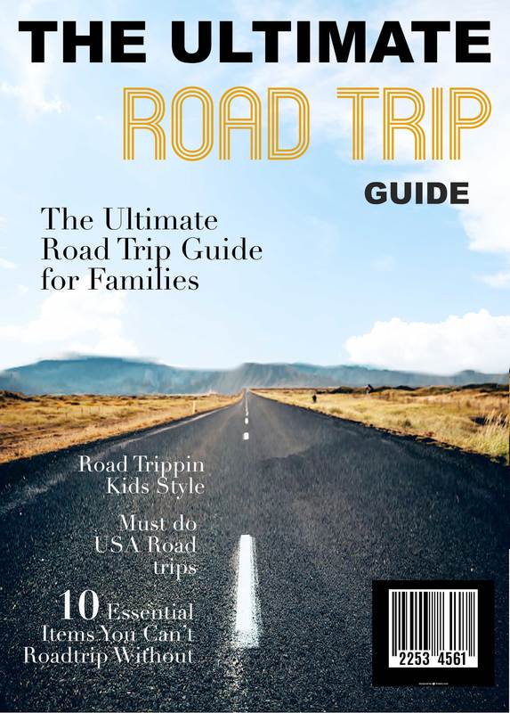
Overview: The purpose of this exhibit is to demonstrate my ability to design a magazine cover in Photoshop.
Design Principles:
Contrast: White text on black backgrounds, and black text on lighter backgrounds. Used supportive fonts, one with a serif, the other without.
Repetition: Because of the road, lines and a sense of movement is in the overall photo. A font with lines and movement was selected to highlight the main topic of the magazine.
Alignment: Used right justified text to add balance to the overall composition, matching the lines in the road.
Proximity: Like content, for example the blurbs highlighting articles found in the magazine, were placed together.
Photoshop Skills:
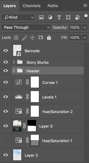
To start, the image used for the cover of this magazine was a landscape photo that I needed to lengthen to fit the 8.5 x 11 inch cover. I used the Content Aware Scale option under the edit menu to lengthen the photo. I then applied a few adjustment layers to brighten and liven up the photo. The sky in the original photo was very over exposed and blown out, I used the pen tool to select the part of the image I wished to keep and then used a layer mask to uncover a brighter more interesting sky. I also used a few adjustment layers to make the sky match the overall color and lighting as the rest of the image it joined.
I used what I know about grids and typography to select and place the text. To add more of a professional look and feel I added the barcode.
Credits: Road Image: Photo by Brodie Vissers on Burst Sky Image: Created by Mrsiraphol - Freepik.com Barcode Image: Created by Freepik Fonts Used: Mexcellent, Arial Black, Didot