Magazine Spread
Overview: The purpose of this exhibit is to demonstrate my design skills in a magazine layout in Photoshop.
Design Principles:
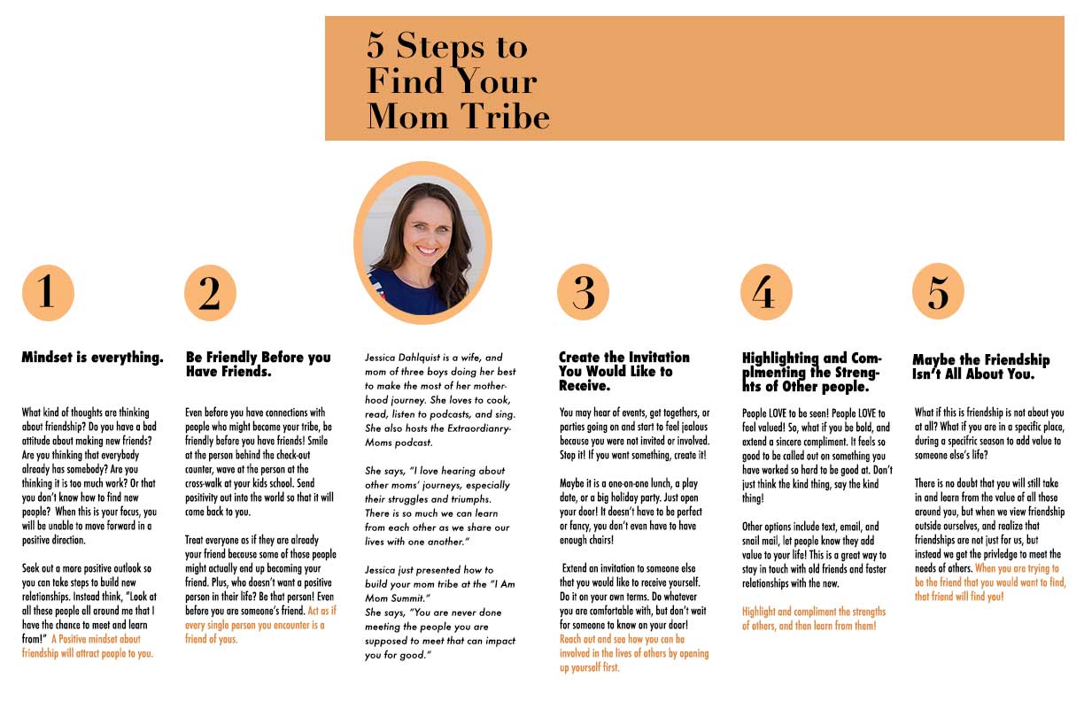
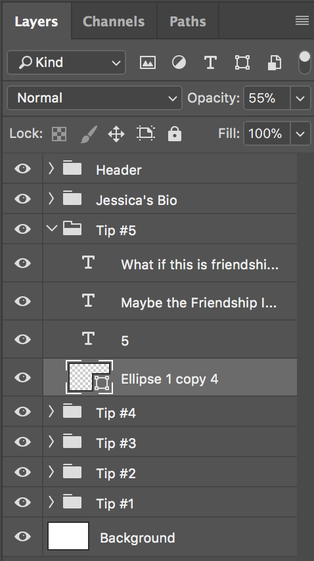
With the bio picture of Jessica, I converted it into a Smart Object so I could crop and size it as needed. I also used a mask to eliminate the rest of the photo. I added an orange ellipse behind the picture using the shape tool. I cleaned up my layer panel by grouping sections of content together.
Credits:
Image of Jessica Dahlquist from the program of the I Am Mom Summit.
Design Principles:
- Contrast: Bright white background in contrast to signature color orange.
Color: Orange was selected because it represents enthusiasm, fascination, happiness, creativity, attraction, success, and encouragement. All characteristics that come from friendship, the topic of this magazine spread. - Repetition: Consistent use of circles and the color orange help unify the piece overall.
- Alignment: Rulers and grids were used to make sure all the pieces of content stayed within the outlined design and grid.
- Proximity: Each column was placed specifically to provide equidistant space between each other and to give some breathing room on the page, making it easier for readers to consume the content.
- Photoshop Skills:
With the bio picture of Jessica, I converted it into a Smart Object so I could crop and size it as needed. I also used a mask to eliminate the rest of the photo. I added an orange ellipse behind the picture using the shape tool. I cleaned up my layer panel by grouping sections of content together.
Credits:
Image of Jessica Dahlquist from the program of the I Am Mom Summit.
